Senior UX Writer
UX Writing
Adobe Monetization and Platform Experience
Ask me about UX Writing projects for Adobe, including:
Consumer
* Passkeys (from scratch)
* Account sharing abuse (from scratch)
* Firefly Generative AI web app Terms of Use violation error messaging
* In-app checkout
* Photoshop update
* Termination card swap
* Gainsight tours
* Recruit for Acrobat Feedback Panel
* Adobe Acrobat new features
Admin
* Domain enforcement
* Gainsight tours
* Enterprise device authentication
* Admin Console tour
* Adobe Experience Manager
Alert messages for UW Medicine website
COVID-19 updates on UW Medicine.org
BEFORE
The alerts were crammed full with too much information – overwhelming users.

AFTER
I write a brief summary of the latest COVID-related changes and hyperlink to the relevant pages. The public is desperate for vaccine information so I include a brief "status update" on who is currently eligible. Character count: ≤160 with spaces

ITERATION: NEW COVID SERVICES AVAILABLE
I link to new COVID-related services – in this case, Post-COVID-19 Rehabilitation Services –from the alert banner. This serves a dual purpose – providing users easy access to new COVID-related services as they develop while also building the new page's link profile.

ITERATION: LESS UPROAR OVER VACCINE AVAILABILITY, MORE SERVICES
The testing page has become far more popular so I move that hyperlink to what we believe to be the prime location (unfortunately no research available to support the hypothesis). Vaccines are now universally available, so I feel safe eliminating the "status update." (The information is just one click away.) I add a link to a new therapeutics page.

This is starting to look a lot like navigation, isn't it? Should COVID be integrated into our navigation? It will depend on the course of COVID.
Initial redesign July 2021
The "Make an appointment" page is a highly trafficked page and a cornerstone of the patient appointing journey.
BEFORE
The page was poorly organized. Distinct calls-to-action were difficult to identify.

What I did
* Wrote dialogue for the online appointing flow that integrates with the scheduling widget (from Epic)
* Wrote all copy including CTA buttons, headlines, subheads, body copy
* Revised copy to align with feedback from diverse stakeholders
* Collaborated closely with our UX Designer and Program Manager

Late 2021: COVID returns with a vengeance
Our UX Designer had left the team so I put my designer hat on to integrate more robust COVID content. I was so slammed with daily COVID content updates that my goal was to make the content as evergreen as possible while still providing useful and relevant information. Our Contact Center was similarly slammed and had started a call-back list to manage vaccine-related call volumes.
Results 41 days after launch
Online booking action conversion increases 43.5%
Online appointing - Book online with provider
My responsibility: All writing
Our Contact Center was overloaded with appointing-related phone calls. Users were unable to book appointments online within the context of the page they were on – at a specific clinic or with a particular doctor.
The ability to book online would solve these problems.
I collaborated closely with our UX Designer, who did the user research and UX/UI design, and Program Manager, who stays abreast of evolving appointing pathways.
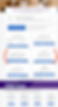
Book with MyChart account
If you have a MyChart account, you can book only with a provider that you've seen within the last 3 years.
It's best to let users know this up front so they don't log in only to discover that they can't schedule with the provider they want.

If yes ...

If yes ...
We bring users to the sign-in for MyChart, the web portal that offers controlled access to EPIC (electronic health records). Our team does not own this platform so we must end the user journey here.

Online appointing - Book online with provider
Book without MyChart account

If no ...

Users select the appointment type ... from the limited options available. The appointment has to "match" EPIC on the back end. The phone number at card bottom provides an alternative appointing pathway if users become frustrated.
Once appointment type is selected ...
